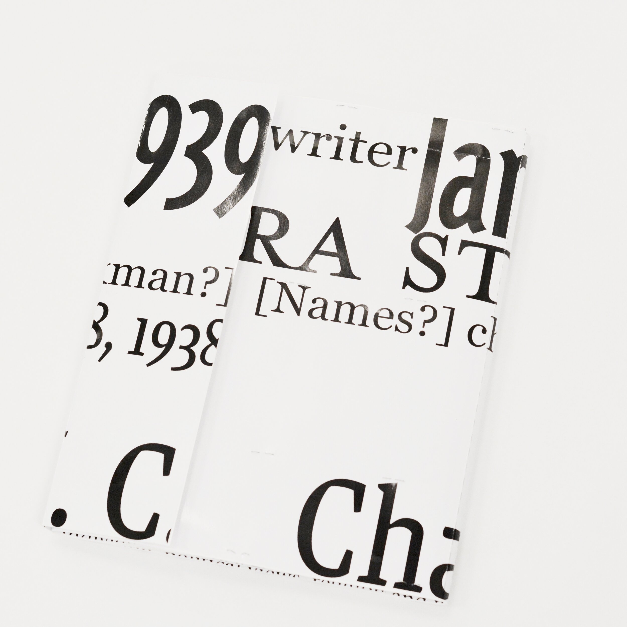
“As Her Cards Get Pinker, She Becomes More Confident”
Typography Samples
My goal for this book was to give a spotlight for each character, and focus on Laura's Story. Her mother abused her, she grew up in poverty, and was never treated with any respect. Her husband Arthur, although very stubborn, gave her the best life he could. He “took care o’ what’s his” Yes he tried to give her a good life, but treated her in an undermining way. “She can’t do nothing” “I don’t know what she can do” were things he would say and also said the reason he married her was because she didn’t have a place to live. I chose to pick out words from every main character and give them more hierarchy with unique type size, color, and weight according to the personality of that character. If a viewer were to just read those words, they would still be able to understand the life and ways of that character. The design of each character’s card has a different color and typography to identify them differently. Laura is in a pink color because I see that color as standing for women empowerment. As her cards get pinker, she becomes more confident.


